PROBLEM
While designing a new product from scratch with no HiFi Design system, designers need an easy way to rapidly design and test features in order to ensure consistency across both the wireframes and the experience.

"I'm seeking an efficient and consistent method for designers to quickly design features for review by project managers and developers before jumping to High fidelity designs. My designers are submitting their LoFi and MidFi feature designs in various formats (e.g., hand-drawn, Figma, other tools, etc) which makes it hard to see the experience as a whole. I need a kit that is helpful in the brainstorming stage, but also needs to have enough level of detail for it to be able to go to dev quickly (for backend work). This will also allow us to see the features as a single experience vs seeing it as a specific designer's piece of the product."
Director of Product Design
SOLUTION
Create a custom UI Kit that empowers designers to swiftly prototype multiple LoFi feature designs, while also facilitating a seamless transition into mid-fidelity via a toggle in the properties panel. Having a library of reusable assets (components) will accelerate the design phase of the UX process and expedite reviews with PMs and developers. This UI Kit will additionally serve as a valuable resource for informing the development of the HiFi Design System by identifying potential new component requirements.
Role: Lead Design System Product Designer - Leading a team of 3 designers
Key Stakeholders: Director of Product Design - Office of Product & Program Innovation (OPPI)
Requested Deliverables: A UI Kit enabling the OPPI Product Design team to expedite V1 design and testing while recognizing the absence of an established HiFi design system, an established UX process, and a product at this stage.
Duration:
- First release - 2 months
- Then went into maintenance stage until June 2023
Outcomes: Adopted by the entire OPPI product design
team
and use of toolkit helped shape the first
UX Process for the team. This kit was also being used by other
departments (outside of OPPI) within the university as well.
Also got recognition from the VP of
Design for the efficiency of the UI Kit.
UX PROCESS & DELIVERABLES
EMPATHIZE
Research
- Competitor Analysis
- Informal User Interviews
DESIGN SYSTEM
DS Liason
- Component Creation in Figma
- Component Testing in Figma
- Manage Component Releases and Announcements
- Documentation & Videos
- DS Liason to Designers
Note: This is a non-linear and iterative process that I am continuously reflecting, refining, and improving upon. The deliverables for each phase is mentioned above.
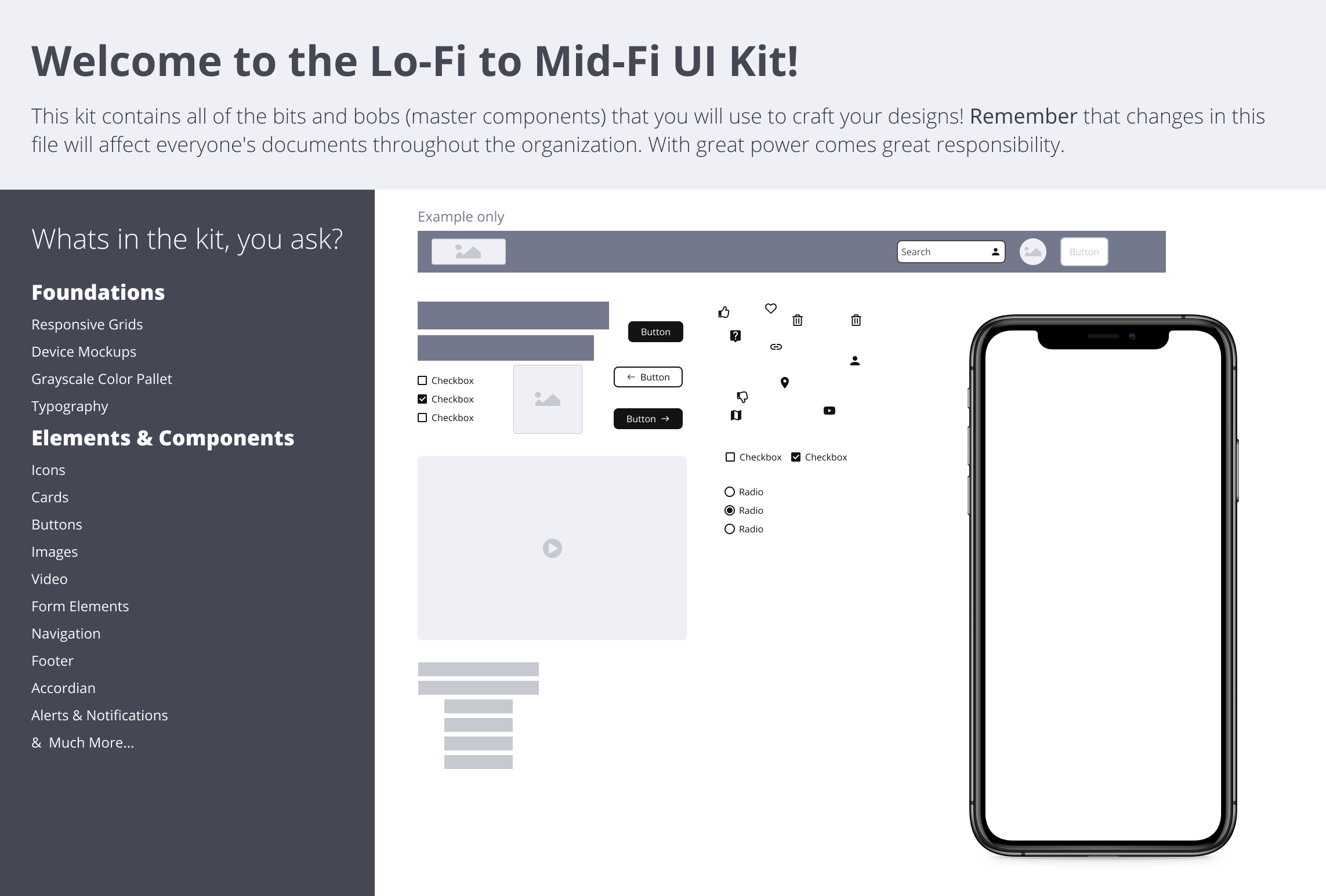
During the empathize phase, a significant portion of my efforts was directed towards conversing with designers and the design director in order to gain a more profound understanding of my users' needs and pain points. This provided me with valuable insights into the varied methodologies that designers employ within their creative processes, and I uncovered specific details pertaining to their work preferences. While I was initially tasked to create a LoFi UI Kit, it quickly became clear that what the product design team needed was a tool kit that allowed for desiging in LoFi and MidFi.
Our Team's Definitions
Low Fidelity (LoFi)
Low-fidelity designs are rough, basic representations of a product or interface. They are used in the early brainstorming stages of the design process to quickly communicate and test concepts without investing significant time or resources.
Characteristics:
- Simple sketches or wireframes
- No text on the UI itself
- No colors used
- Limited detail and minimal visual elements
- Focus on layout, structure, and basic interactions
- Quick to create and easy to modify
Mid-fidelity (MidFi)
Mid-fidelity designs represent a more detailed and refined version of a prototype. They provide a balance between the simplicity of low-fidelity and the realism of high-fidelity, allowing for more refined testing and evaluation.
Characteristics:
- More detailed than LoFi, with added visual elements, but still no use of colors
- Welcomes feedback from senior stakeholders because it is not as polished as a HiFi design
- Can have some level of interaction and functionality
- Strikes a balance between speed and realism
- Suitable for user testing and feedback on a more developed concept
EMPATHIZE
During the empathize phase, I spent time engaging in discussions with designers and the design director to gain a deeper understanding of my users' needs, motivations, and pain points. This process provided valuable insights into the diverse approaches that designers employ in their creative processes and revealed their preferences for working.
Interview Findings:
- Designers need a way to easily and quickly test different LoFi designs/layouts
- Some designers need text capabilities on the UI to give context for user testing
- Some designers don't want to use text on their actual LoFi designs
- There needs to be enough level of detail so it can be user tested
- Director of Product Design wants to see consistency in fidelity so it looks like a hollistic product vs having designers use different methods of LoFi
- Director of Product Design wants it to be a reusable toolkit that designers can leverage to ensure consistency accross the product
Project Direction & Analysis:
I also looked at existing LoFi UI Kits like (Balsamiq, Miro, and Figma Community) to see if there was an existing tool that could be leveraged. While I was initially tasked to create a LoFi UI Kit, it quickly became clear from my discussions that what the product design team needed was a tool kit that allowed for desiging in LoFi & MidFi. Because of the speed at which designers had to pump out designs for development, allowing designers to be able to switch a component quickly from Lofi to MidFi became pretty important.
Click to enlarge
- Competitor Analysis
- Informal User Interview
DESIGN SYSTEM
Project Mangement and Organization
I used JIRA & AHA to help me roadmap, plan, assign tasks to teammates, and maintain consistency. I scheduled weekly check-ins with my team and I would schedule working sessions when someone reached a roadblock. I also set up checkpoints with the stakeholder along the way to show progress and make room for any pivots needed early on.
In Progress work was shared at design reviews, providing an opportunity for feedback and collaboration. Completed components were showcased at demos, not only to colleagues within OPPI but also to external stakeholders and partners. These demonstrations fostered transparency and increased adoption of the LoFi to MidFi UI Kit.
Designers were able to track bugs in JIRA and tag me. The details of what needed to be included in the ticket and the steps to submit a bug were outlined in the Zeroheight documentation. Once I was tagged in the bugs, I would prioritize them and assign them to a designer and to a specific sprint.
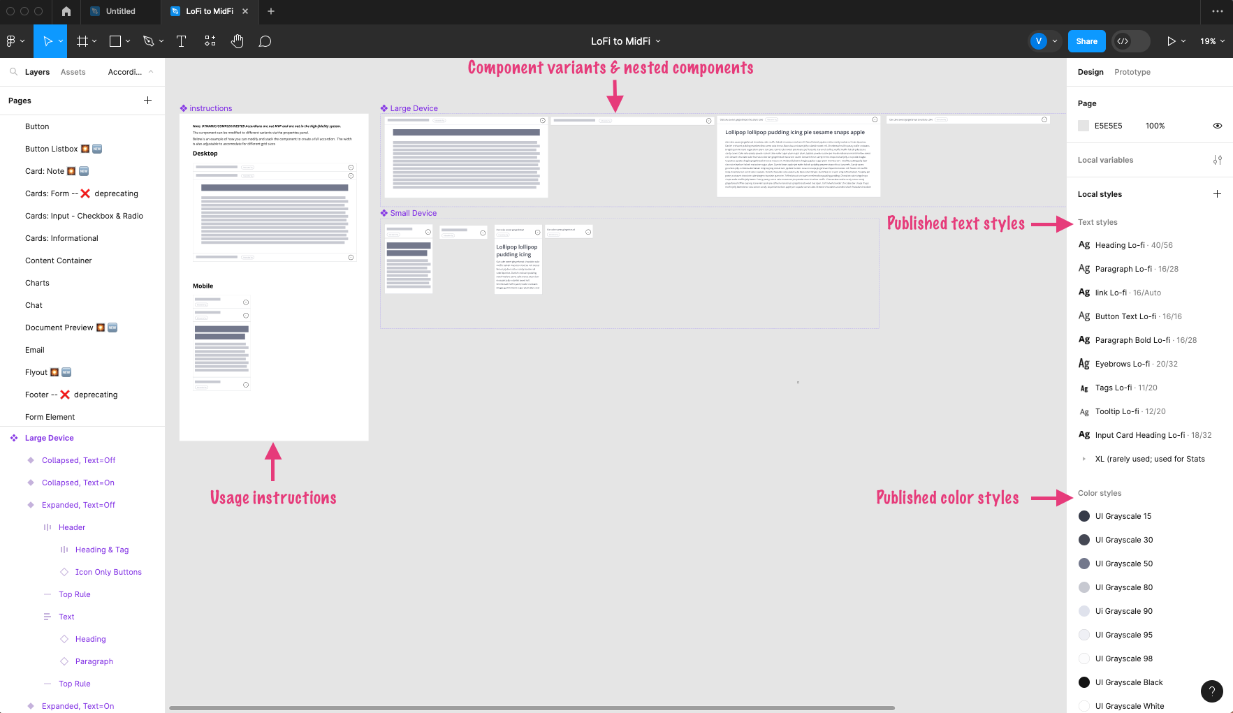
Component Creation Consistency in Figma
To enhance the designers' experience, my team would meet to establish standardized component build practices for all Figma components. These standardized component build patterns included:
- features like a single toggle for switching between square blocks to represent text (LoFi) and actual text (MidFi)
- autolayout nesting consistency
- naming consistency
- variant grouping
- unified color palette
- design style
- component nesting consistency
- and so much more!
Click to enlarge
Testing Figma Components
Upon completion of the Figma build for a component, the designer would tag me for a QA review. The component then underwent testing for all variations to ensure proper functionality and adherence to the standardized component build patterns outlined above. When a bug was identified, it was returned to the original designer. Once the issue was resolved, the component went through another round of QA testing. Bug fixes also followed a similar testing process.
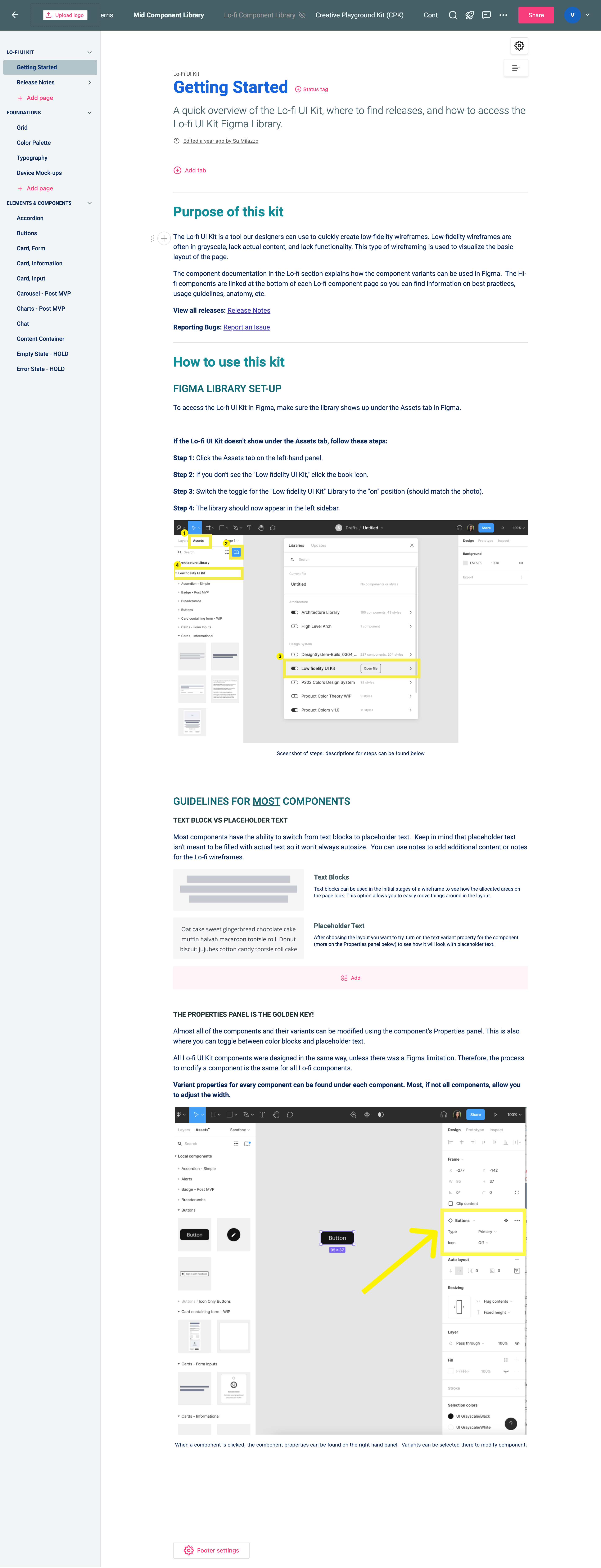
Documentation, DS Liason duties, & Managing Releases
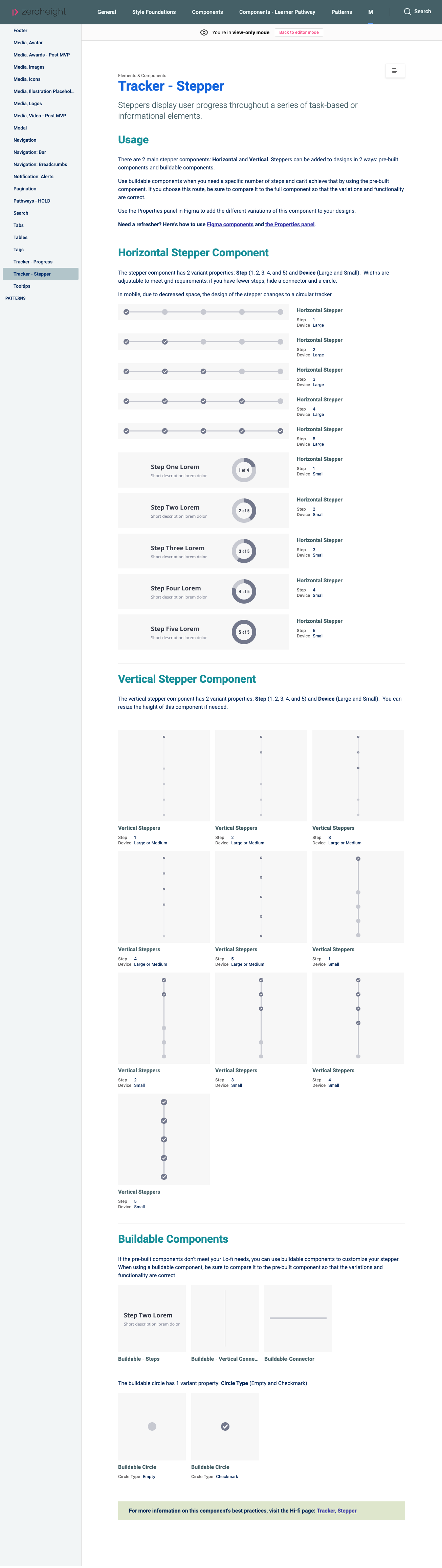
After successfully passing the testing process in Figma, the component was prepared for documentation in Zeroheight. The kit's documentation comprised of a getting started page, release notes, a foundations section (covering grid, color palette, typography usage, and device mockups), and a dedicated page for each component. Once documented, the component was published in Figma for others to access and utilize. These component pages detailed all variants and provided usage instructions. Subsequently, an announcement was shared in our Microsoft Teams channel to inform designers that a component was ready for use.
In addition, I created instructional videos, presented to designers, and shared insights with individuals both within and outside of OPPI. I not only explained how to use the kit but also highlighted what distinguished this kit from existing solutions. I consistently acknowledged and appreciated my team's hard work during all presentations, giving them well-deserved shoutouts on Shine, in meetings, and in team retrospectives.
Click to enlarge
Click to enlarge
- Project Management in Jira
- Component Creation in Figma
- Component Testing in Figma
- Component Releases and Announcements
- Documentation & Videos
- DS Liason to Designers
LESSONS LEARNED
Leading this project was a valuable learning experience for me. One of the most crucial skills I learned was the ability to ask the right questions at the start of the project to uncover the stakeholders' and users' true needs. In my role as the lead, I also gained insights into the importance of organization, maintaining team morale, and mastering the art of delegation. Additionally, I learned how to effectively collaborate with and lead designers with diverse working styles and experiences. This experience not only bolstered my confidence in my skills but also offered me invaluable leadership lessons.