PROBLEM
After conducting a competitive analysis and user research, I discovered that users need an all encompassing app where they can quickly find and book legal appointments (covered by their legal plan) because they don’t have the time to call in during the law firm's office hours. We will know this to be true when the number of appointments at various practices increase.

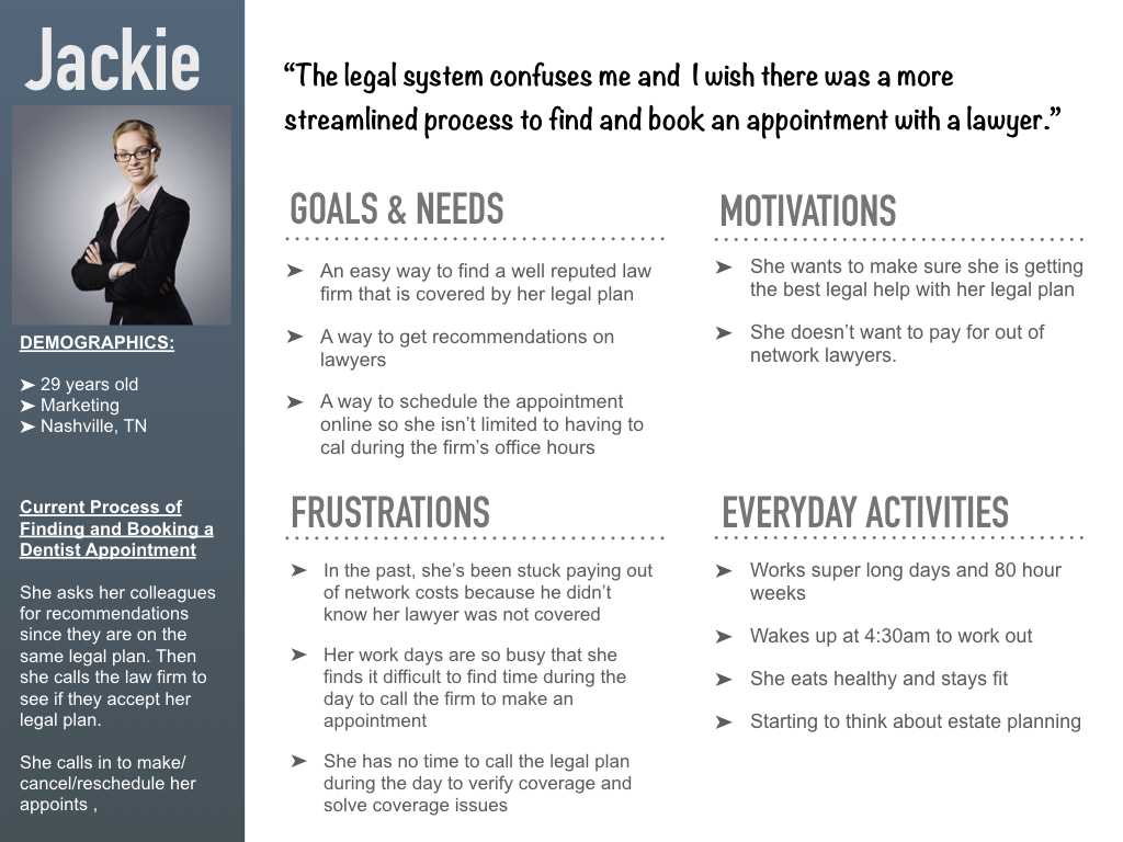
The legal system confuses me and I wish there was a more streamlined process to find and book an appointment.”
Jackie, Our Persona
SOLUTION
Legal Now is a mobile application that allows users to easily find law firms, read reviews on lawyers, check legal plan coverage, book appointments, and accept payment.
Role: UX Designer
Duration: 1.5 weeks
Clients: Name changed due to NDA
Key Stakeholders: CEO and Project Manager
Requested Deliverables: First iteration of high fidelity wireframes and UX process
MY UX PROCESS
To get from the problem to a viable solution, I leveraged my UX process, which consisted of 4 phases encompassing all four UX areas.
Understand
Strategy
- Competitive Analysis
Empathize
Research
- Problem Statement
- User Interviews
- Personas
- User Stories
Ideate
Architecture
- Task Analysis
- User Flows
Design
Interaction Design
- Wireframes
- Prototypes
- Usability Testing
For the Legal Now application, I incorporated aspects of the UX Design Thinking Process that I could complete in the tight timeline I had. I relied on user research at the beginning and throughout the UX process.
UNDERSTAND
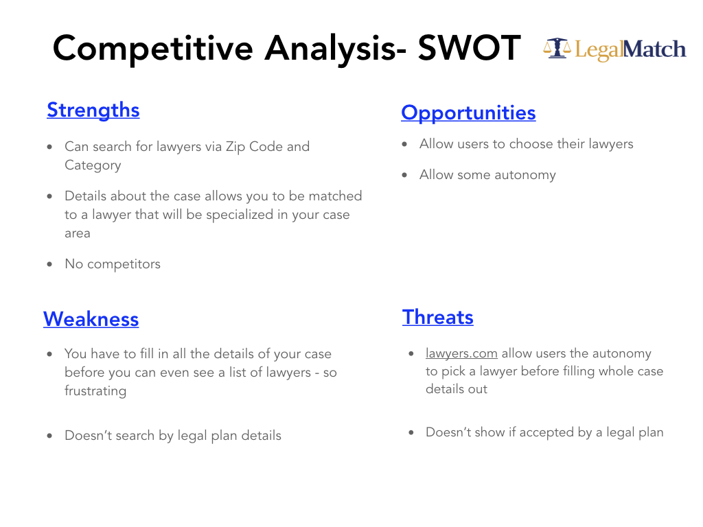
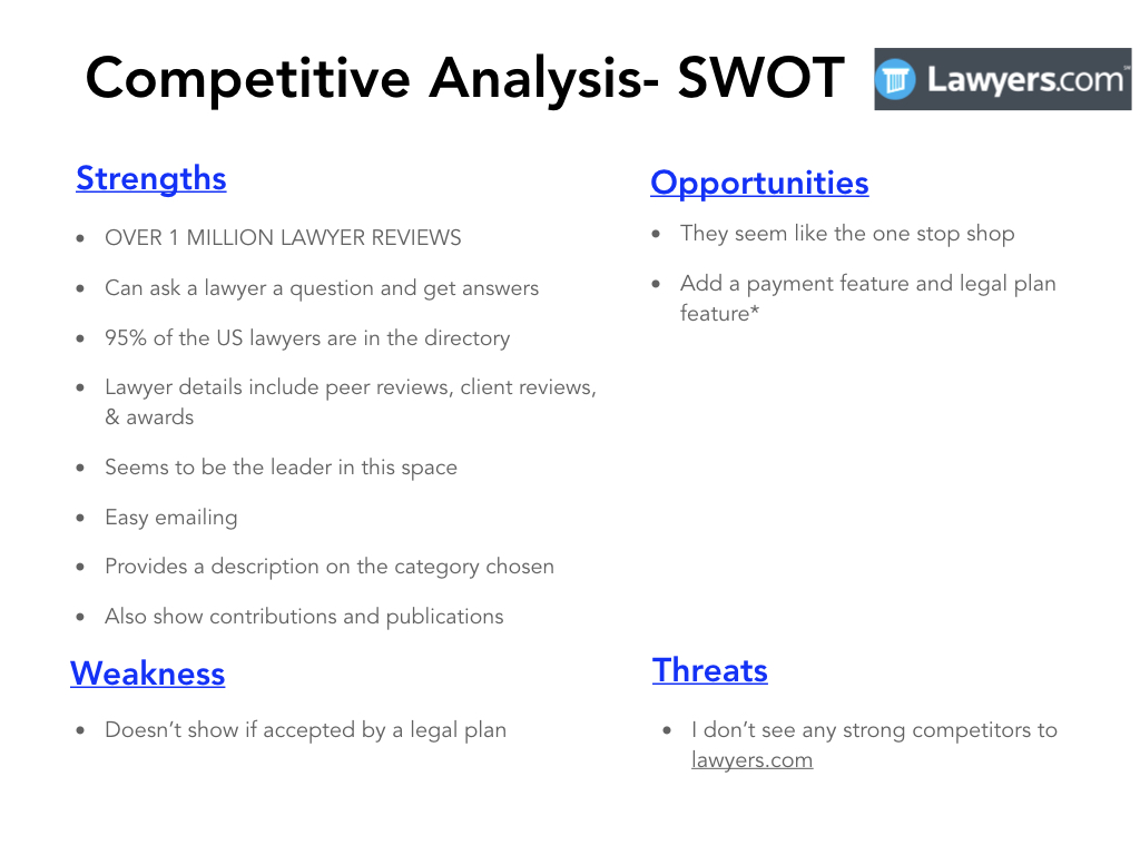
In the experience strategy portion, my main focus was on comprehensively understanding the problem. Researching what my competitors were doing well and what they were doing poorly, allowed me to get insight into gaps in the industry. I enjoyed using the SWOT method with my competitive analysis because it allowed me to organize my findings and find opportunities to set Legal Now apart from its competitors.
Click to enlarge
Click to enlarge
- Competitive Analysis
EMPATHIZE
In the user research portion, my main focus was to understand the users of the Legal Now application. I started by conducting user interviews on participants with different backgrounds from the ages of 22 to 37.
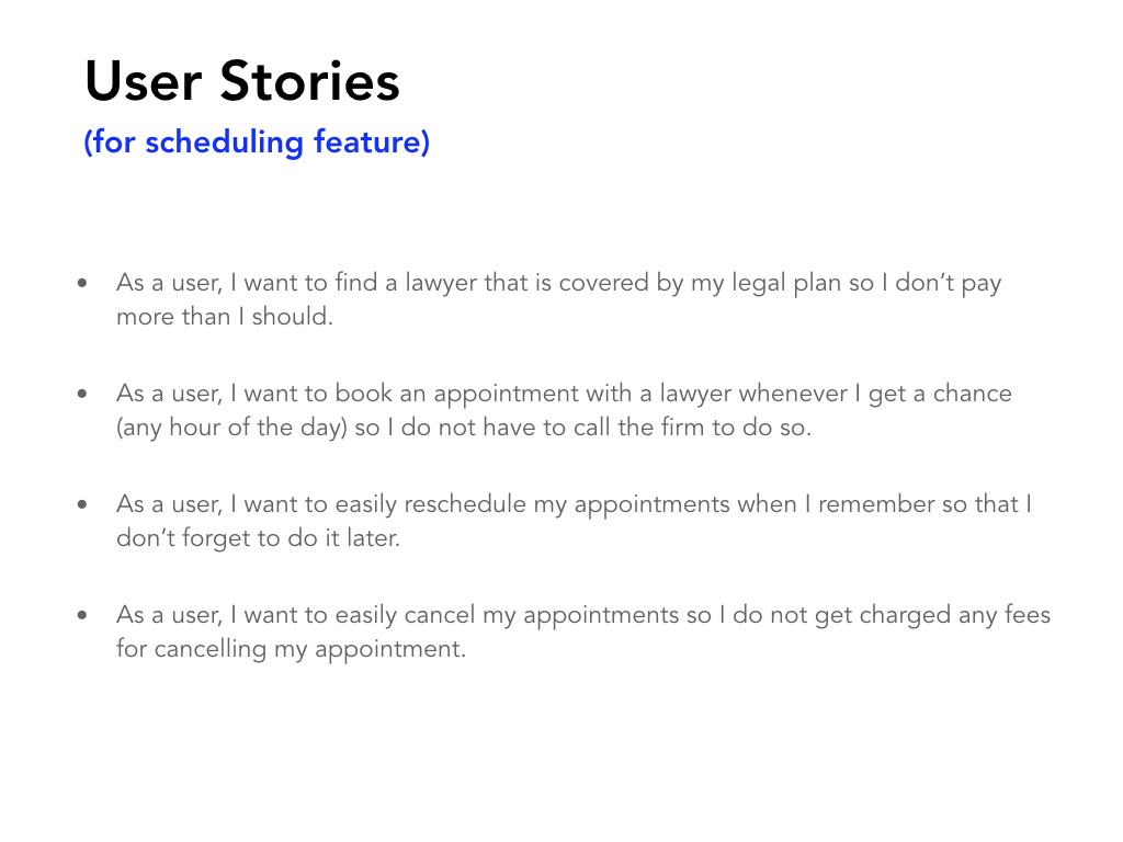
Utilizing my user interview findings and competitive analysis, I was able to confirm Legal Now's problem statement. The user interview results also allowed me to dive deeper into understanding the users' wants, needs, motivations, and pain points. I organized my interview results into a persona, and I was then able to create my user stories.
Click to enlarge
Click to enlarge
- Problem Statement
- User Interviews
- Personas
- User Stories
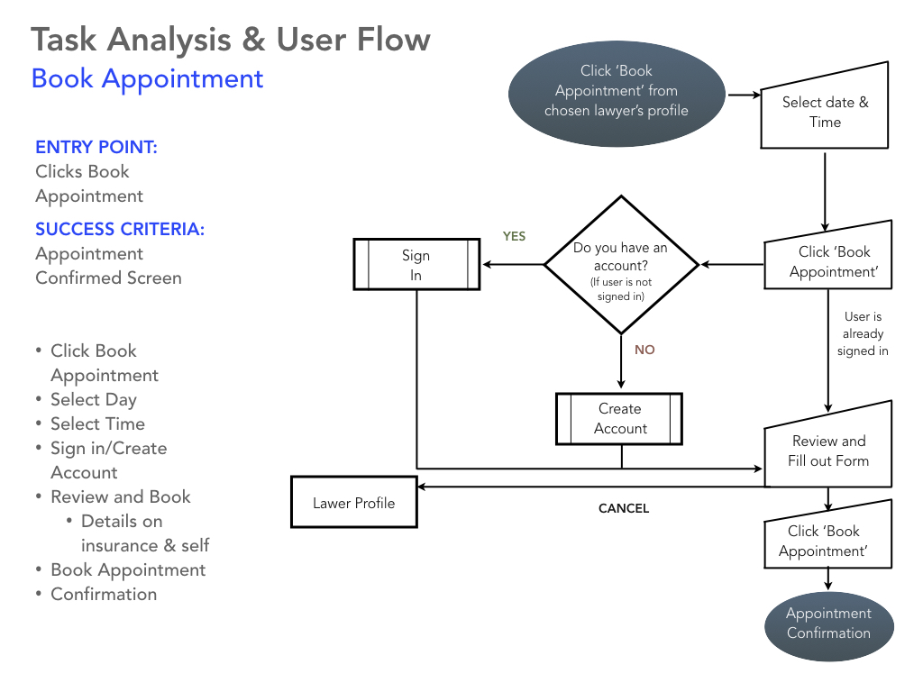
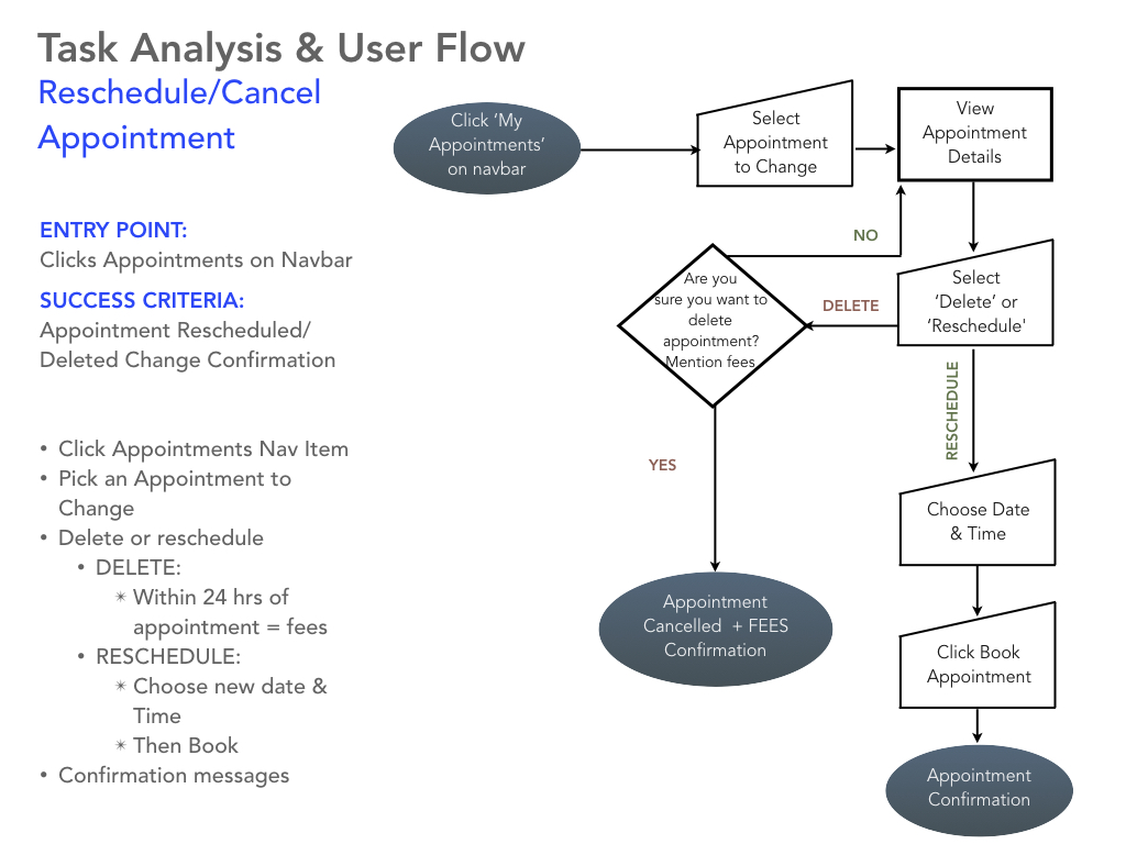
IDEATE
Since I would only be focusing on the scheduling feature for the first deadline, I utilized the information I gathered in the previous stages to create relevant user flows and task analyses. This allowed me to set the stage for how many screens, processes, and paths I would have to design.
Click to enlarge
Click to enlarge
- Task Analysis
- User Flows
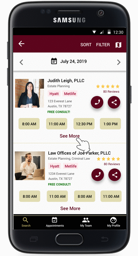
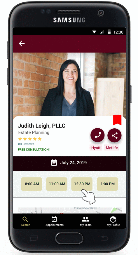
DESIGN
With my user flows in hand, I began to list out the key features I would focus on for the first deadline. I started by hand-drawing low fidelity mobile sketches to help me figure out different layouts I would use.
Color Palette:
I chose to use the maroon (#5C041C) because it evokes a sense of elegance and tradition. Choosing that darker red also tones down the bold red, which can elicit feelings of danger and excitement. Legal matters are often crucial, so the maroon (#5C041C) gives the right balance. I chose to use the gold (#C5BB69) because it evokes feelings of wealth, riches, and wisdom. Both these colors worked well together and gave my designs a great look and feel.
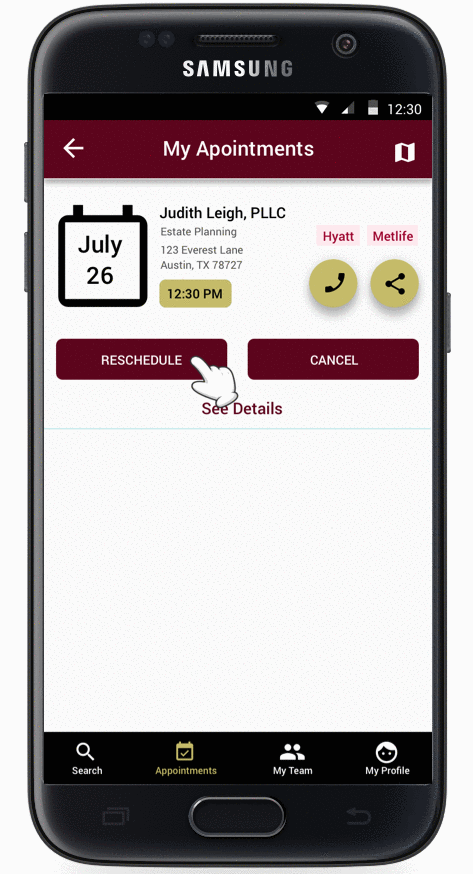
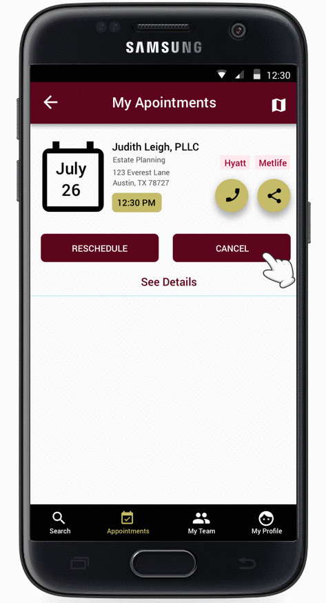
Usability Testing:Due to this project's nature and the rapid turn around time, I was unable to perform formal usability testing. Instead, I ran informal usability tests with 3 of my friends who fit the demographic, and I got some valuable feedback. Tasks included booking, rescheduling, and canceling an appointment. One of the critical issues testing uncovered was that 2 out of the 3 participants found the cancel button confusing.
Participants thought the cancel button on the pop-ups were to escape out of the pop-up. They did not realize that the cancel would start the cancel appointment process. However, when the cancel button on the "my appointments" screen led to no confusion. So in the next iteration, I propose adding the word appointment to the button in the pop-ups or changing the question so it is more evident. Also, participants brought up the valid issue of "what if I want to reschedule an appointment with a different lawyer within the same practice?". They mentioned that it would be tedious to cancel the appointment and then go search again for the specific lawyer in the same firm to book an appointment. This is also something that will be addressed in the next iteration.
Click to enlarge
Click to enlarge
Click to enlarge
Click to enlarge
- Low-Fidelity Prototypes
- High-Fidelity Prototypes
- Usability Tests
LESSONS LEARNED
One of the most significant lessons I learned during this project was the importance of taking the time out to get user feedback no matter how short the project duration was. The information I received from my user interviews and my informal usability tests were valuable, and it helped me design an experience that caters to addressing user needs. This was challenging because of the timeline, but I am glad I spent a good portion of time on really understanding the users.