PROBLEM
Currently, there is no structured approach to the way we present all our different residency programs on our University of Texas Health departmental websites (over 22 programs).

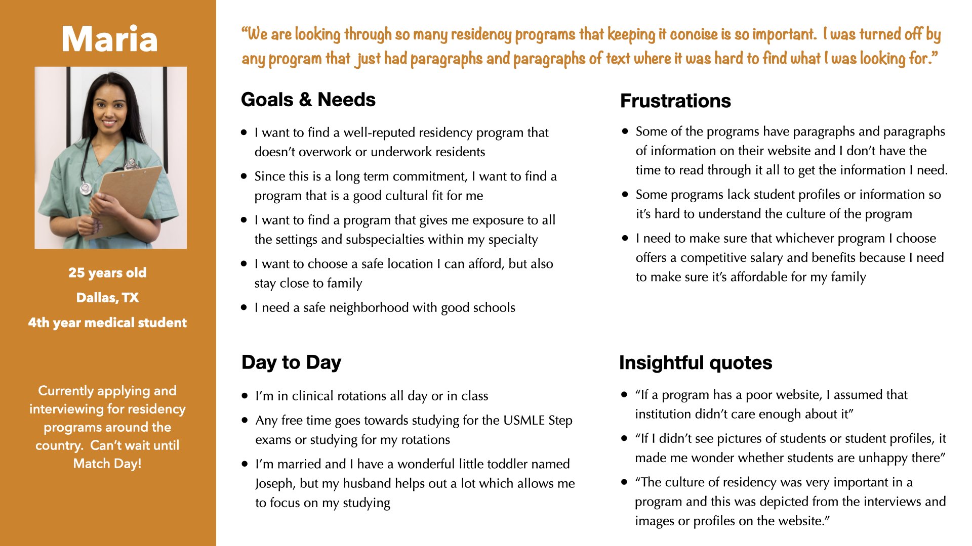
"Honestly, the [residency application process] is inherently just overwhelming. The process, because it's so competitive, that you're applying to 40-some programs off the bat. What that means is if you're already going to be applying for it, you're going to be looking at 80. That's why I was saying conciseness is everything."
Maria, Prospective Resident
SOLUTION
Over the course of the website redesign projects for the four different School of Medicine Departments (Rehabilitation Medicine, Neurosurgery, Emergency Medicine, and Orthopedics), I was able to improve and optimize my designs to create a reusable but also customizable educational section template/product.
Role: UX/UI Designer
Key Stakeholders: Program Directors and School of Medicine Project Manager
Requested Deliverables: Full or partial website redesign focusing on the education's residency sections
Duration:
- Department of Rehabilitation Medicine - 6 months
- Department of Neurosurgery - 4 months
- Department of Emergency Medicine - 4 months
- Department of Orthopedics - 3 months
UX PROCESS & DELIVERABLES
UNDERSTAND
Experience Strategy
- Informal Competitive Analysis
- Google Analytics
- Heuristic Evaluation
- Content Audit
EMPATHIZE
User Research
- Problem Statement
- Interview Analysis Spreadsheet
- Personas
- User Interviews
IDEATE
Info. Architecture
- Sitemaps
DESIGN
Interaction Design
- Wireframes
- Prototypes
- Informal user feedback
- Handoff Documentation
- Accessibility Review
Note: This is a non-linear and iterative process that I am continuously reflecting, refining, and improving upon. The deliverables for each phase is mentioned above.
To get from the problem to a viable solution, I leveraged my UX process, which consisted of 4 phases encompassing all four UX areas. I also incorporated aspects of the UX Design Thinking Process that I could complete within the tight timelines. I incorporated user research and stakeholder engagement throughout all the iterations of my UX process.
Each department's redesign can be thought of as an iteration to the Education Template product. So Rehabilitation Medicine's request was the first iteration, Neurosurgery was the second iteration, and so forth. Keep in mind that within each iteration, there were multiple sub-iterations as well for each department.
I stay organized with my multiple projects via my Project Tracker spreadsheet, which tracks all the details for every page I am working on for a given project. More details on this can be found in the design phase of my UX process.
UNDERSTAND
During this initial phase, the project manager, UX manager, and I met up to debrief on the initial client meeting. This was a chance for me to get the project's scope, clarify the stakeholder goals and requirements, and define the initial UX process I wanted to use for this specific project.
Goals
- Client goals for all 4 departments: Full website redesign to the updated design system with a primary focus on improving the residency section (education section) since that's the bread and butter for each department
- Make sure all the content users need is clearly organized and displayed
Google Analytics were also pulled from our live sites to get a feel for what pages within the education sections were most visited. Analytics revealed that the residency landing page was the most visted and the team directory was the second most visited pages. When the Department of Orthopedics wanted to get rid of their directory, this analytics along with our user interview data came in handy to justify why we needed to keep the team directory. To better understand residency websites, an informal competitor analysis was also conducted.
Technical Constraints
These 4 sites were built in Wordpress, so the stakeholders can go in and update the content when needed. There are some design limitations because our design system elements are not as robust in wordpress as they are in our Drupal CMS.
- Informal Competitive Analysis
- Google Analytics
- Heuristic Evaluation
- Content Audit
EMPATHIZE
With the project requirements and stakeholders' goals in hand, I was ready to dive into my user research.
First Iteration:
I led moderated in-person user interviews with new residents to better understand the residency application process and what draws prospective residents/med students to choose a specific residency program. These interviews helped me learn that medical students and future residents look at numerous residency sites during the residency application process and that they tend to favor websites and programs where the information they are looking for is easily found, concise, and organized.
Data from the interviews were analyzed in the Interview Analysis/Coding Spreadsheet with quotes, observation type, interpreted response, and topics/themes. The spreadsheet allowed me to quickly reference my interview data throughout the various iterations. Using the data, I was able to create a persona to highlight our user needs, motivations, goals, and frustrations to our stakeholders. Creating a persona helped me organize my key findings and understand the key user needs and motivations, and how to prioritize them.
Second, Third, & Fourth Iterations:
While formal usability testing was not conducted due to time and resource constraints, both stakeholders and residents gave feedback on designs throughout the entire process. Residents attended most stakeholder meetings and were active participants in the redesigns.
- Problem Statement
- Interview Analysis Spreadsheet
- User Interviews
- Personas
IDEATE
With my user research insights, I created an initial sitemap for my stakeholders for the first iteration focusing on the residency portion. From the second iteration onwards, I quickly learned that I needed to make this education and residency template flexible for each department's unique needs. Some departments had multiple residencies and no fellowships, while others had 1 residency program or multiple residencies and multiple fellowship programs. The design and information architecture had to account for all these variations while still adhering to our older design system.
So while this was not a product design project during the first iteration, I modified the way I tackled this problem. During the second, third, and fourth iterations of this project, I was looking at it from a product design mindset where the customizations were similar to features.
The clearest way to accommodate for the template's customizations within a program was by incorporating a sub-navigation to the program landing page. The first iteration served as the basic residency template upon which the more complex residency program evolved from.
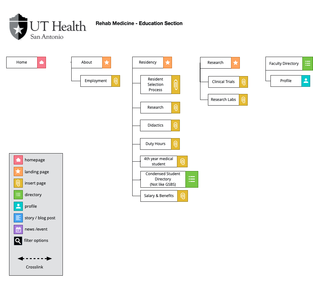
Click to enlarge
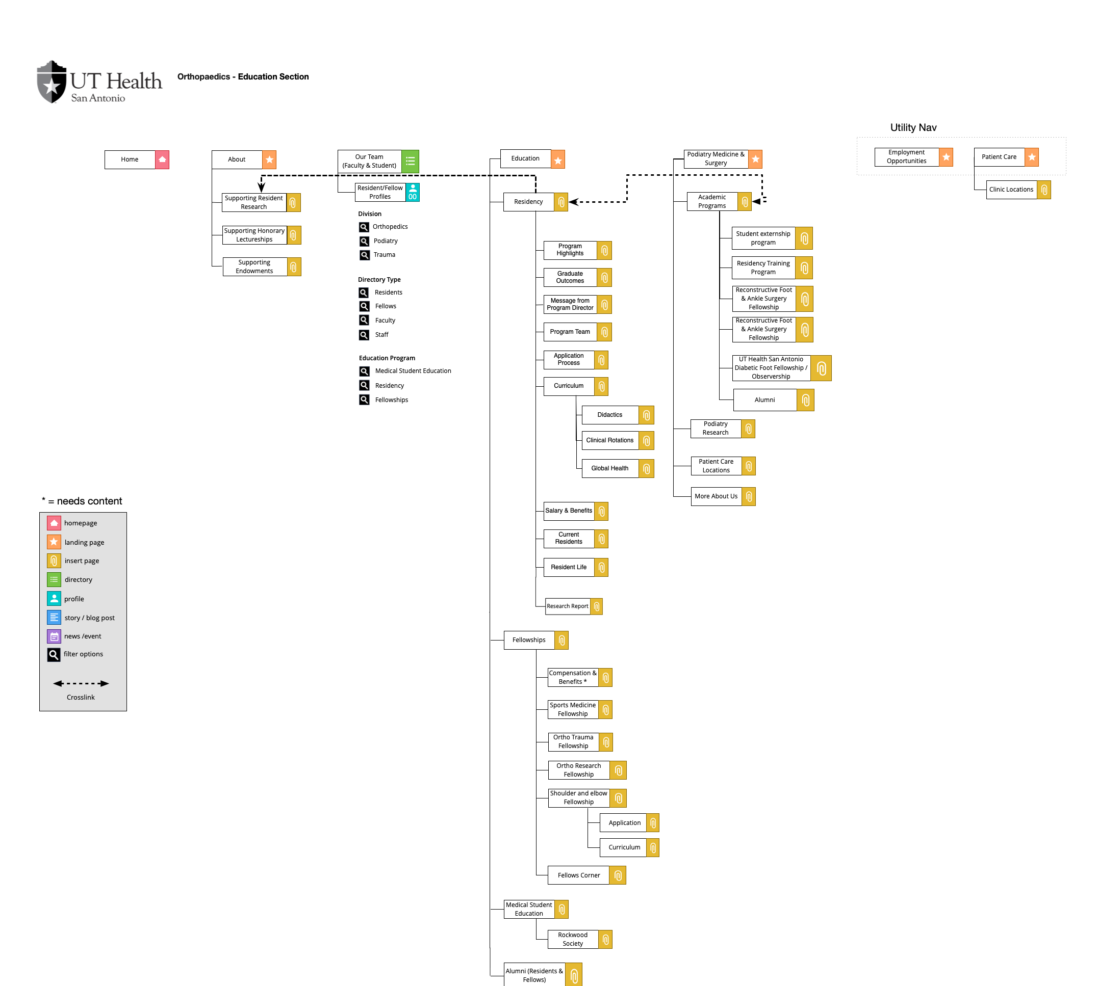
Click to enlarge
- Sitemaps
DESIGN
I started off with low fidelity wireframes and then went to high fidelity prototyping in HTML, CSS, and Javascript. Along the way, I referenced our pattern library and design system so that my designs would stay consistent and on-brand.
Education Landing Templates
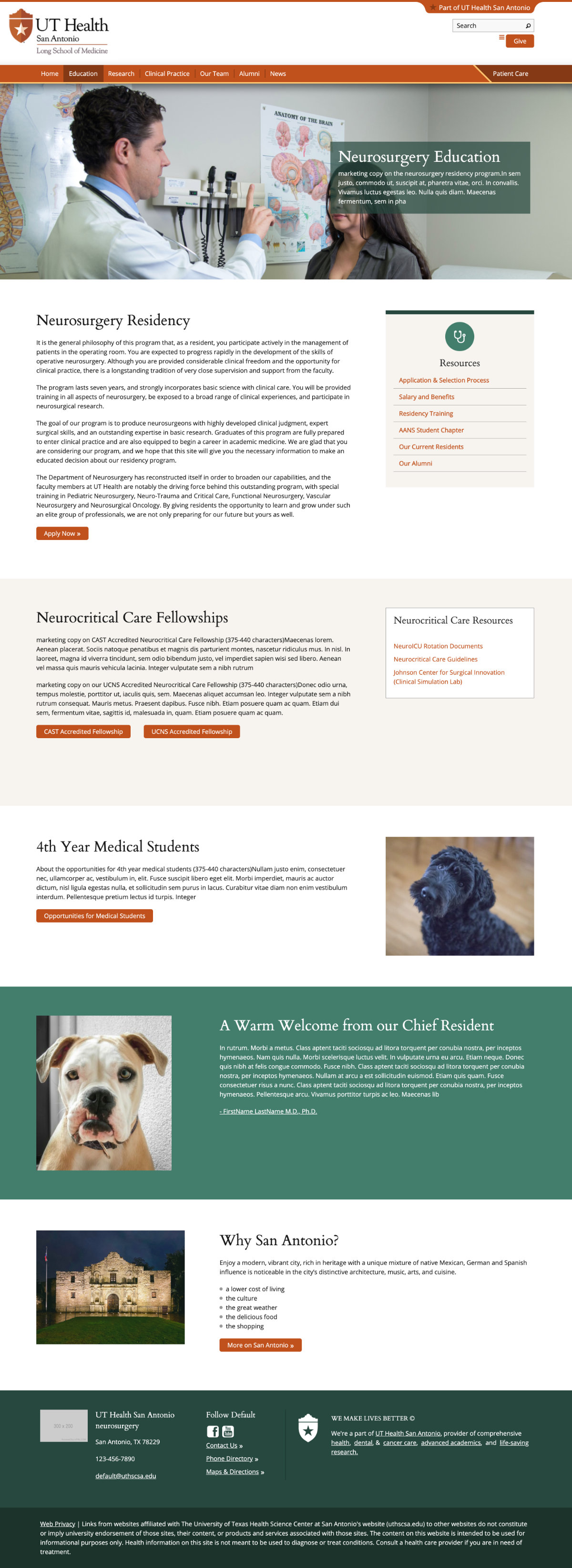
Version 1 With the first education landing page, you can see that it directly went to the residency landing page. Because this department had no other educational programs, this layout worked for this specific department. Based on the user interviews, key content was highlighted within the accordions and the sections below.
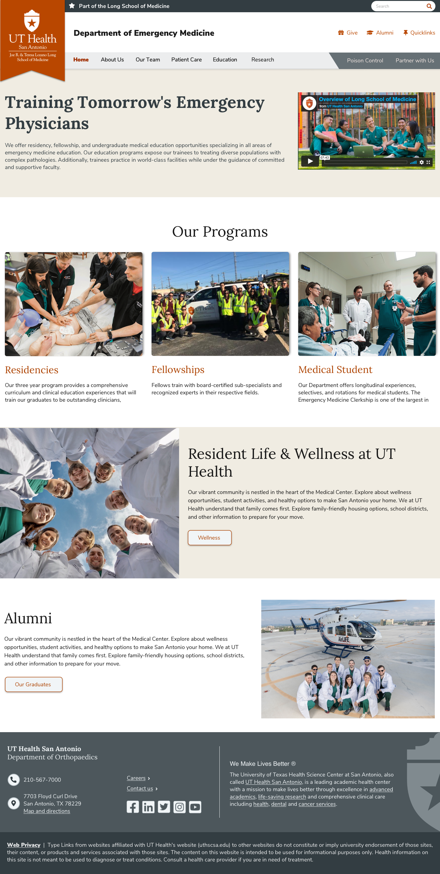
Version 2 The version 2 education landing page included information for a residency and fellowships section. But it did not account for growing sections, and the layout was long. Based on how heatmaps show user behavior, I also realized users wouldn't be able to see at a glance all the programs available unless they scrolled to the bottom.
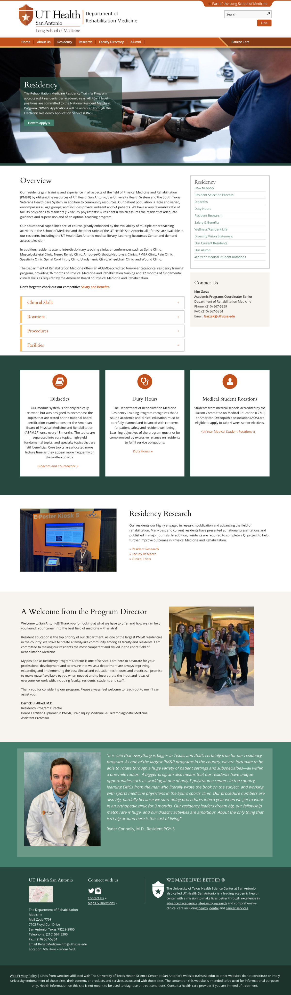
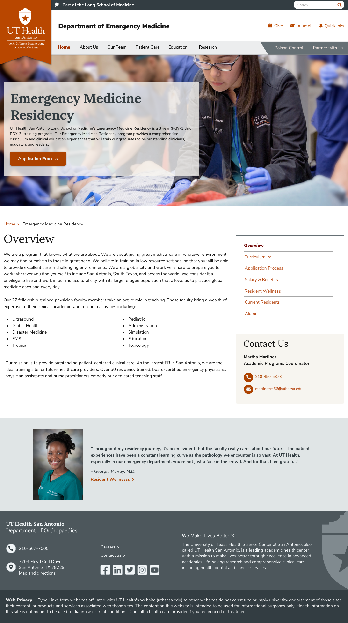
Version 3 - New design system For the education landing page, this layout design will become the standard. This allowed users to see the available programs above the fold without having to scroll too far. Within each program, users will be greeted with a landing page with a sub-navigation highlighting the key areas that our users mentioned help to decide on a program (e.g. didactics, procedures, resident/fellow life and wellness, salary & benefits).
Residency Landing Template V3 - New design system
For the residency landing page, it quickly became apparent with the second and third iterations that each department has similar content, but varying amounts of content with each sections. Throughout the sub-iterations for each program, it became apparent that departments wanted to add more content to their residency sections. To accomodate for this ask and to make it work with the template model, the third design is where we landed. This allowed users to pick and choose what content they wanted to access without bombarding them with too much content. The new residency landing template can easily accomodate for varying amounts of content.
My Contributions to the New Design System
- Choose the framework/library for our tech stack
- Lead the user testing of elements, templates and functionality
- Navigation and Header - scalable across 3 levels
- Headings - typography & sizing
- Elements: Quicklinks, Icon Guidelines and Usage, Cards/Callouts/Panels, Modals, Templates, Code Elements using HTML/CSS/JS
- Design System Documentation (use cases and guidelines)
Click to enlarge
Click to enlarge
Click to enlarge
Click to enlarge
Metrics and Usability Testing
Tracking metrics to see how this template performs with users is something I have been strongly advocating for within my department. Qualitative usability testing, path analysis, and quantitative metrics (e.g. the number of applicants; time on destination pages) will give me insight into whether prospective users find the information they need.
I am also advocating for measuring user satisfaction via a short optional survey that pops up in the residency section. This will give me insight into how easily prospective residents were able to find what they were looking for and what information they wish was on the site.
When tracking analytics and metrics for this project, it is important to keep in mind that results would be most relevant between June to February since that is when prospective residents are applying and interviewing for residency programs.
My Project Tracker & Dev Handoff:
I manage all my enterprise-level projects using the Project Tracker spreadsheet, which tracks the status of every page I am working on for a given project. In addition to tracking the status, it also has the URLs for my deployed prototypes, Blueprints(design instructions), architecture for where each page lives, and recommended CMS URLs. This tracker allows my project managers to quickly find my projects' status and also provides a single source for the dev team to have everything they need to implement my designs. I always ask the dev team to review my designs when I implement a new design or tweak something that is part of our design system. This helps me avoid the issue of presenting a design the client loves and then finding out it's not possible due to technical contraints.
- Low-Fidelity Wireframes
- High-Fidelity Prototypes
- Informal user feedback
- Accessibility Review
- Completed Project Tracker
LESSONS LEARNED
One of the most important lessons I learned from this project was always make sure that your design be adaptable with the addition or deletion of content. Looking back on my designs, the first iteration did not initially account for the stakeholders wanting to add more content. Preparing for that before it happened would have allowed me to incorporate the subnavigation into the design in a cleaner manner. Since content editors will go in and add and delete content, this is something important I learned to incorporate into all my designs. This project was the importance of taking the time out to get user feedback no matter how short the project duration was. The information I received from my user interviews and my informal usability tests were valuable, and it helped me design an experience that caters to addressing user needs. This was challenging because of the timeline, but I am glad I spent a good portion of time on really understanding the users.