PROBLEM
Tattoo enthusiasts want to make sure they are fully informed before getting a tattoo to avoid any future regrets. Currently, there isn't a single source that users can visit, which walks them through the journey of getting a tattoo.

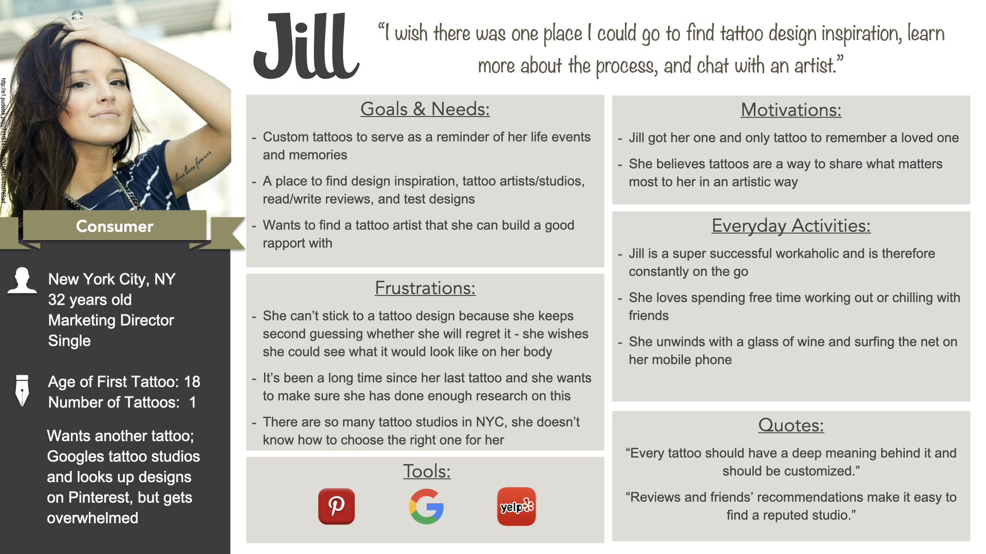
I wish there was one place I could go to find tattoo design inspiration, learn more about the process, and chat with an artist.”
Jill, Our Persona
SOLUTION
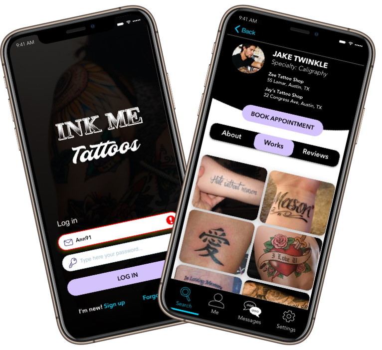
That's how the idea for InkMe was born! InkMe is a one-stop tattoo application that takes users through the journey of getting a tattoo from finding their tattoo designs to booking their initial tattoo consultation.
MY UX PROCESS
This was a super fun passion project that I
continued to iterate on after successful
completion of my UX bootcamp. To get from the
problem to a viable solution, I leveraged my UX
process, which consisted of 4 phases
encompassing all four UX areas.
After multiple iterations of this process, the designs for the InkMe mobile application started to come together.
Understand
Strategy
- UX Analysis
- Business Req. Doc
- Problem Statement
- Competitive Analysis
Empathize
Research
- User Interviews
- Personas
- Journey Map
Ideate
Architecture
- Task Analysis
- User Flows
- Card Sort
- Sitemaps
Design
Interaction Design
- Wireframes
- Prototypes
- Usability Testing
- Style Guide
UNDERSTAND
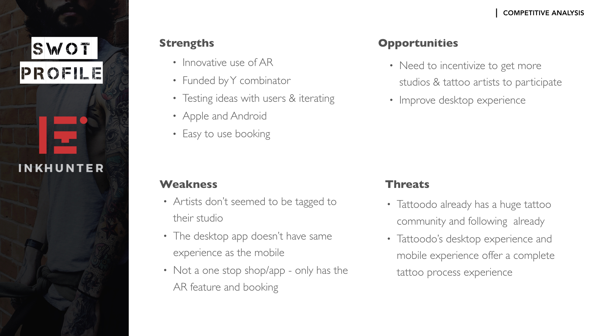
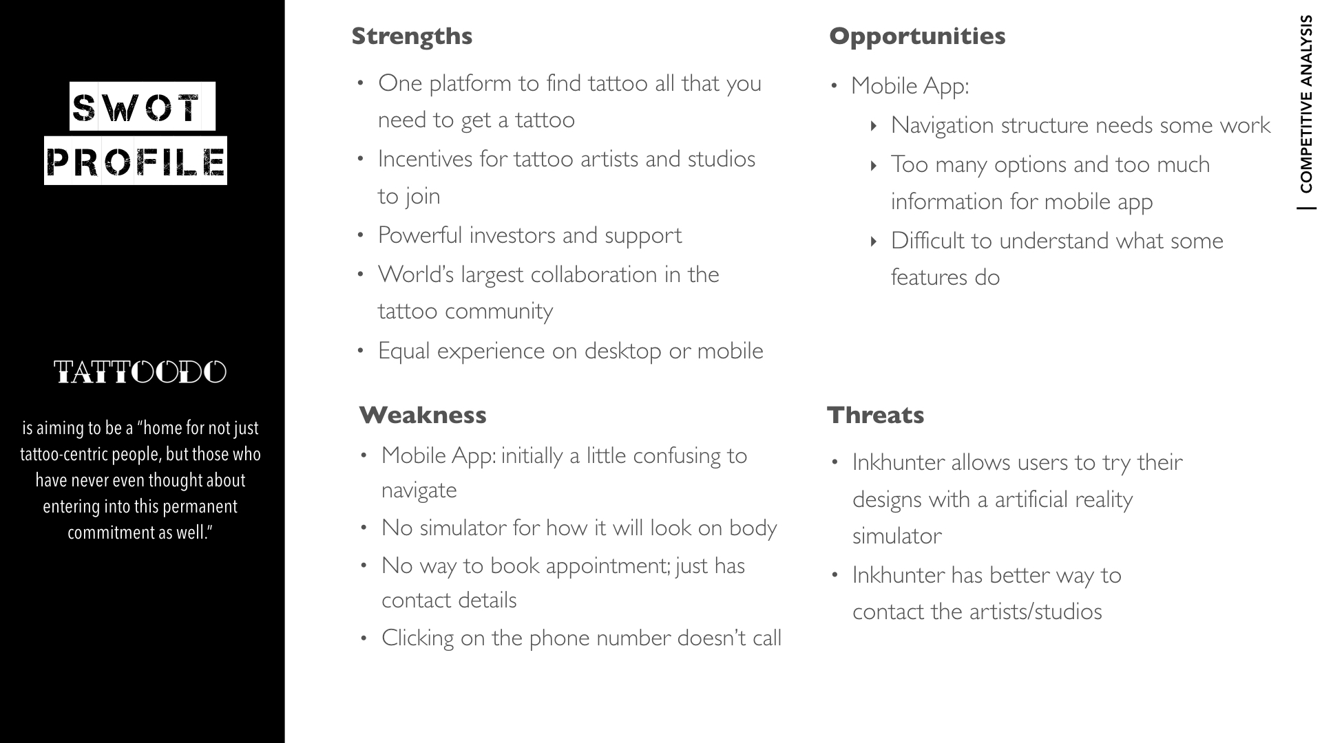
In the experience strategy phase, my main focus was on truly understanding the problem.Once I formulated my problem statement, I completed a competitive analysis on 2 of the leading tattoo applications on the market: Tatoodo & Inkhunter.
Researching what my competitors were doing well and what they were doing poorly, allowed me to create a list of critical features that would set InkMe apart from its competitors. Once I compiled my findings and analysis into a Business Requirement Document (BRD), I created my user stories.
Click to enlarge
Click to enlarge
- Problem Statement
- Competitive Analysis
- Business Requirement Document
- User Stories
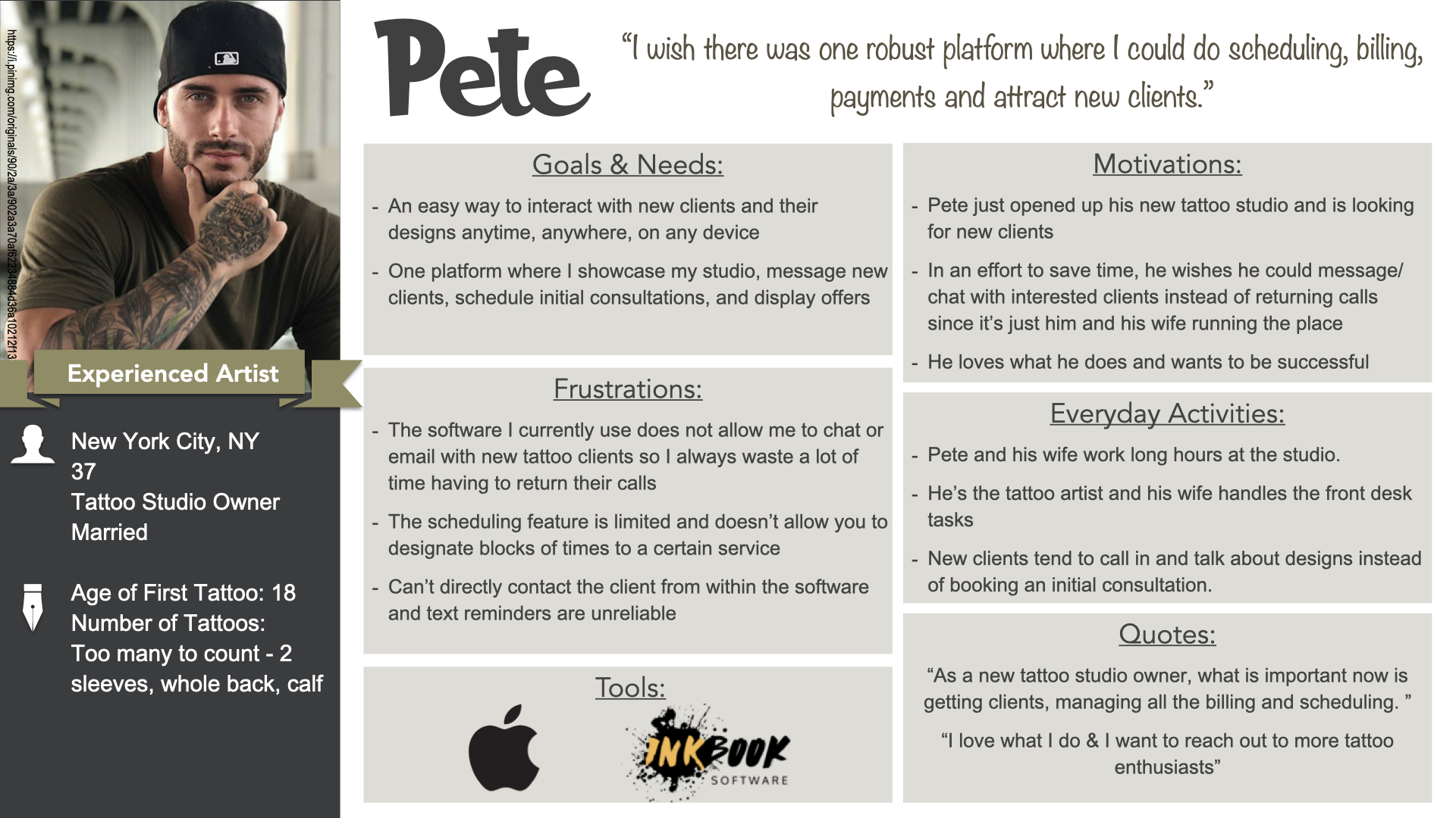
EMPATHIZE
In the user research portion, my main focus was to understand the InkMe Application users - Tattoo artists and the consumers/client. The main focus for phase one of this app was the consumer/client. I started by conducting user interviews on a variety of tattoo enthusiasts between the ages of 18 to 40 who either have tattoos or want to get their first.
Conducting user interviews allowed me to dive deeper into understanding our users' wants, needs, motivations, and pain points. Utilizing my user interview findings, I was able to create client personas. Although we were not focused on the tattoo artists for phase 1, we still conducted surveys to gather some preliminary information so there wouldn't be any major discrepancies later.
Click to enlarge
Click to enlarge
- User Interviews
- Personas
- Journey Maps
IDEATE
I created a Journey Map, Task Analysis, and User Flow for each persona from the last phase. In the information architecture portion, my main focus was on taking what I learned from my user research and creating the basic structure and organization of content for my application. To understand how users would organize the content on the InkMe application, I conducted a digital open card sort (22 cards) using OptimalSort.
The results:
- showed that participants struggled with categorizing My settings, Help, And Account Settings into one overarching category
- confirmed that splitting up the main navigation into Design, Artist, and Studio were favored
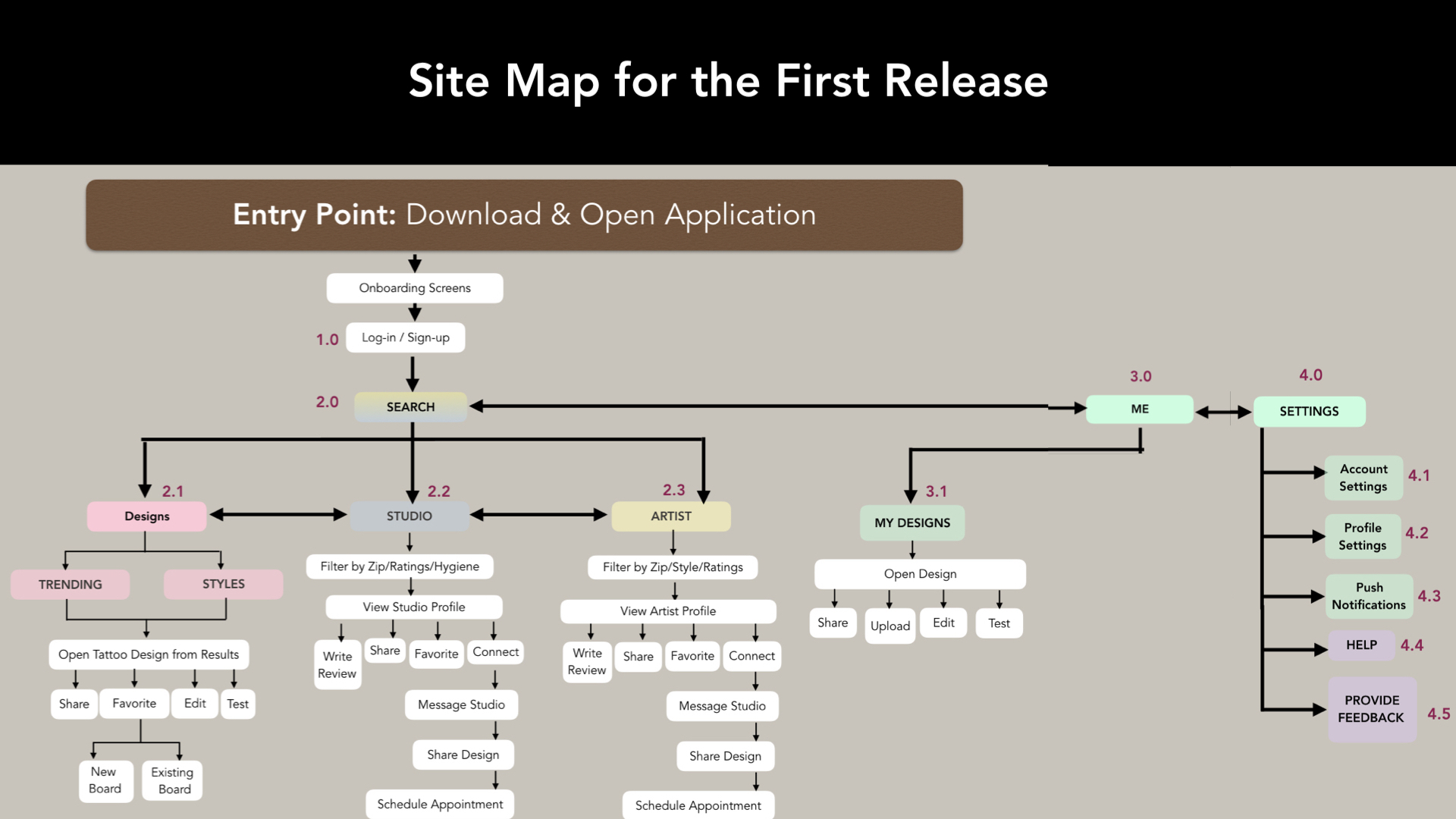
Click to enlarge
- Task Analysis
- User Flows
- Card Sort Analysis
- Sitemap
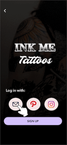
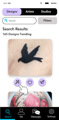
DESIGN
With a user-centered sitemap in hand, I began to list out the key features I would focus on for the first release. This allowed me to narrow down some essential tasks my users would eventually complete for my usability tests.
I started off by drawing low fidelity mobile and desktop prototypes that not only showed the layout but also explained the interactions. I then iterated on my designs and used Flinto and Balsamiq to create my mid-fidelity prototypes. After that, I went on to create my high-fidelity InkMe Desktop and InkMe Mobile prototypes using Sketch and Invision.
My usability tests gave me tremendous insights into what my users loved about the application, as well as where they struggled most. This helped me discover what changes needed to be implemented in the next iteration to improve usability.
This is a video of the very early stages of usability testing results and the changes I was exploring for the second iteration. In subsequent iterations, the name of the app as well as the design styles changed.
Second Iteration Modifications Based on Usability Testing
Final Iteration
Click to enlarge
Click to enlarge
Click to enlarge
Click to enlarge
- Low-Fidelity Prototypes
- High-Fidelity Prototypes
- Usability Testing
- Usability Test Plan & Reports
- Style Guides
Features for Initial Release
Main Focus: Tattoo Consumer
- Tutorial/Onboarding
- Login/Sign-Up
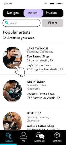
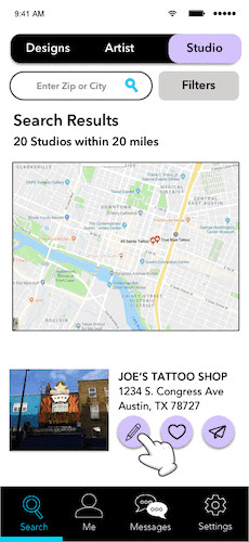
- Search Tattoo, Designs, Artists with Filters
- Edit, Test, Save, and Share Designs
- Test Designs on Your Body (Augmented Reality)
- Favorite Tattoo, Designs, Artists
- Read and Write Reviews
Features for Future Release
Articles and Blog Posts; Scheduling Appointments; Pay for Your Tattoo; Artist Portal; Messaging Platform; First Tattoo Corner; Upload/Edit Tattoo
1 Minute Promo Video of
an Older Iteration
and Old Branding
LESSONS LEARNED
One of the most significant lessons I learned during this project was the importance of including users throughout the entire design process - user interviews, card sorting, and usability testing. A lot of times, as UX designers, we are so engrossed in designing our products that what we think makes sense may not always make sense to users. My card sort and usability testing gave me valuable insight into how I could make my application better and improve the experience for users.